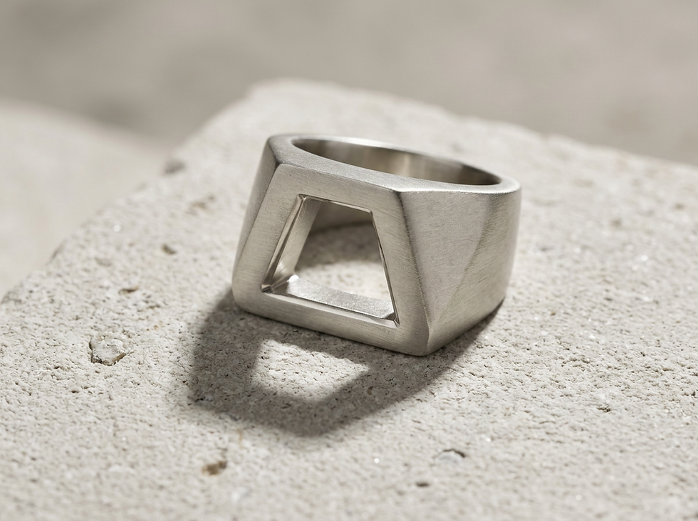
The Architecture of Proportion
WEARABLE ARCHITECTURE · THE HOUSE LEDGER
Before a piece can be shaped, polished, or worn, there is a more fundamental decision: what material will carry the object into existence?
Some jewels announce themselves before the eye has understood them. A ring may feel calm, powerful, ceremonial, or severe in a fraction of a second. The gemstone may be rare, the metal may be noble, the setting may be exact, but none of those qualities alone explains the sensation of presence.
Presence begins in proportion.
Architecture is often mistaken for structure. In jewelry, as in buildings, structure matters. A ring must hold. A clasp must close. A stone must be secure. Yet architecture is also the art of relationships, the measured conversation between height and width, mass and void, line and curve, center and edge.
A jewel becomes inevitable when its parts appear to belong to one another. The stone does not seem placed on the ring. The metal does not merely contain it. The shoulders, gallery, bezel, prongs, and shank form a complete thought. That is the architecture of proportion, and it is one of the reasons certain pieces endure beyond fashion.

Proportion gives form its authority
A jewel can be technically perfect and still feel unresolved. The stone may be brilliant, the polish immaculate, the metal substantial. Yet if the proportions are uncertain, the piece loses authority. It may feel too heavy, too thin, too tall, too timid, or strangely divided.
Proportion is not decoration. It is the discipline that decides whether a jewel feels composed.
In a ring, every measurement affects another measurement. The diameter of the stone changes the necessary width of the shank. The height of the gemstone changes the visual weight of the setting. The thickness of a bezel alters the character of the entire composition. Even a small change in one line can shift the mood of the piece from delicate to architectural, from ceremonial to austere.
This is why proportion gives jewelry its presence. It allows the object to stand with clarity. The eye does not need to calculate the ratio. It simply recognizes balance, tension, emphasis, and order.
That recognition is ancient. Temples, arches, vessels, and sculpture have always relied on proportion to create a sense of permanence. Jewelry works on a smaller scale, but the principle remains the same. The object must hold the gaze through the harmony of its parts.
The relationship between parts matters more than size
Scale and size are often confused. Size is a measurement. Scale is a relationship.
A large stone can feel refined if the surrounding architecture gives it room, support, and proportion. A small stone can feel important if it is set with intention. Scale is the reason a modest diamond may feel monumental in the right ring, while a larger stone may feel awkward if the setting does not understand its force.
The question is never only “How big is it?” The better question is “How does it relate?”
A gemstone relates to the width of the band. The band relates to the finger. The shoulders relate to the crown. The crown relates to the height of the stone. The metal beneath the stone relates to the space above it. These relationships determine whether the jewel feels complete.
A ring with a wide shank and a very small center stone can feel grounded, almost signet-like, if the design intends that weight. The same pairing can feel accidental if the stone appears swallowed. A slender band with a high-set gemstone can feel graceful, but if the elevation is unsupported, it may appear fragile rather than elegant.
Good proportion is not a formula. It is judgment.
The finest ateliers do not simply enlarge or reduce a design. They redraw the relationships. A ring made for a larger stone cannot always become the same ring with a smaller stone. The gallery may need a different rhythm. The shoulders may need a different rise. The metal around the gemstone may need to be quieter, or more present, depending on the desired effect.
A line has visual weight
In jewelry, a line is never neutral. It may be fine, broad, sharp, rounded, interrupted, continuous, taut, or soft. Each quality carries weight.
A thin line can feel fragile, but it can also feel exact. A heavy line can feel powerful, but it can also feel blunt. A curved line may seem generous. A straight line may seem disciplined. The decision is not only technical. It is architectural.
The edge of a bezel, the sweep of a shank, the outline of a gemstone, and the angle of a shoulder all influence how a jewel is read. The eye follows lines before it understands construction. It senses direction, pressure, and pause.
Consider a bezel. If it is too wide, it may dominate the stone and reduce its light. If it is too narrow, it may look timid or unsafe. When it is proportioned well, it frames the gem with authority. It says the stone has been considered, not merely held.
The same is true of prongs. Fine prongs can make a stone appear open and luminous. Stronger prongs can give the jewel a more architectural character. Their length, placement, and thickness decide whether they disappear into service or become part of the design language.
Visual weight also comes from shadow. A recessed channel, a raised rim, or a cut beneath a setting can make a line feel deeper than its physical measurement. In a small object, shadow becomes structure. It gives the jewel relief, and relief gives it presence.

Dominance must be intentional
Every composition has a hierarchy. One element usually leads. The gemstone may dominate. The metal may dominate. The silhouette may dominate. Pattern, texture, or repetition may take command. The issue is not dominance itself. The issue is whether dominance has been chosen.
When a center stone commands a ring, the metal must respond with discipline. It should support the importance of the stone without competing against it. That may mean a quiet shank, a precise bezel, or a setting that lifts the gem into clear focus.
When the metal dominates, the gemstone may become an accent within a larger architectural form. This can be powerful. A deeply carved gold ring with a small, intense stone can feel more mysterious than a large gem in a conventional setting. The stone becomes a point of light within mass.
When the silhouette dominates, the jewel is understood first by its outline. A cuff, medallion, or signet ring often works this way. The gemstone, if present, must strengthen the profile rather than distract from it.
Problems arise when several elements compete for primacy. A bold stone, heavy ornament, complex texture, and dramatic profile can overwhelm one another. The eye has no path. The object becomes loud rather than strong.
Luxury often lies in restraint. Not absence, but control. Presence comes when the leading element is clear and every other part knows its role.
The gemstone sets the first architectural condition
A gemstone is not only a material. It is a volume, a color, a source of light, and a set of proportions already determined by nature and cutting.
An emerald-cut stone brings long planes and quiet flashes. It asks for a different architecture than a round brilliant, which throws light in every direction. A cabochon carries softness and depth. It may call for metal that feels protective or sculptural. A pear shape creates direction. A marquise creates tension. An oval creates openness and continuity.
Color also changes proportion. A deep blue sapphire may appear visually heavier than a pale aquamarine of similar size. A dark stone can anchor a composition. A transparent stone can make the same volume feel lighter. Opaque stones often carry mass with a different dignity, closer to sculpture than sparkle.
The setting must respond to these qualities.
Metal around the stone is never just a border. It controls the transition between gem and body. A thin rim can make a stone seem more exposed. A strong rim can make it feel embedded, almost architectural. Negative space can lighten a setting. A closed back can intensify color or add ceremonial weight.
This is where the hand of the atelier becomes visible. Not in excess detail, but in the sensitivity of the junction. The place where stone meets metal is one of the most important decisions in a jewel. It can make the piece feel forced, or it can make the stone seem as though it could exist nowhere else.

The ring is a small building for the hand
A ring has architecture because it must solve several problems at once. It must hold a stone securely. It must sit on the hand. It must survive wear. It must offer a view from above and from the side. It must feel right in motion, not only in a tray.
The top of a ring receives the most attention, but the side view often reveals the intelligence of the design. The gallery shows how the stone is carried. The shoulders show how the setting rises. The shank shows how weight is distributed. The underside shows whether comfort was part of the architecture from the beginning.
The human scale changes everything.
A ring is not a miniature sculpture that happens to be worn. It belongs to the hand. It must respect the curve of the finger, the space between neighboring fingers, and the gestures of daily life. A ring that looks striking but fights the hand has failed one of its essential tests.
This does not mean every ring must be discreet. A bold ring can be comfortable. A sculptural ring can be wearable. The difference lies in proportion. Height must be balanced with base. Width must be balanced with contour. Weight must be distributed so the ring does not feel unstable.
The most successful rings often have a sense of inevitability. The visible form and the hidden construction seem to agree. There is no ornamental surface disguising an unresolved body. The architecture is complete.
Rhythm gives the eye a path
Proportion also lives in rhythm. Repeated stones, engraved lines, fluted edges, pavé fields, and alternating metal forms all create movement. Repetition gives the eye a path to follow.
Rhythm can be quiet, like evenly spaced prongs around a stone. It can be ceremonial, like repeated gold ridges around a central gem. It can be architectural, like stepped shoulders rising toward a setting. When rhythm is controlled, it creates calm. When it is careless, it creates noise.
Spacing is as important as the repeated element itself. A row of stones may fail because the stones are wrong, but often it fails because the distance between them has not been resolved. Too close, and they blur. Too far apart, and the rhythm breaks. The interval is part of the design.
Repetition also changes the perceived scale of a jewel. Small repeated elements can make a surface feel intricate and expansive. Large repeated elements can create strength and order. The designer must decide whether rhythm should guide attention to the center or distribute attention across the whole piece.
The strongest rhythm feels discovered rather than applied. It grows from the form.
Asymmetry needs discipline
Symmetry offers immediate order. It gives the eye rest. Many jewels rely on it for good reason, particularly rings centered around a single stone. Symmetry can create dignity, ceremony, and calm.
Asymmetry is more difficult. It can feel alive, but only when controlled by proportion.
An asymmetrical jewel cannot depend on mirroring. It must find balance through visual weight. A larger form on one side may be balanced by a darker stone on the other. A strong line may answer a smaller but more intense detail. A void may counter a mass. The composition must still feel resolved, even when it refuses exact equality.
This is where disorder and freedom separate. Disorder lacks relationship. Freedom still has law.
A jewel with asymmetry may feel natural, artistic, or modern, but it must never feel accidental. The eye should sense that each imbalance has been weighed. When done well, asymmetry gives presence because it holds tension without collapse.

Presence comes from measured restraint
Presence is not the same as size, brilliance, or complexity. A jewel has presence when it seems fully resolved. It holds its place. It does not ask for attention through excess. It earns attention through proportion.
This quality can be quiet or dramatic. A slender ring with a finely judged oval stone may have presence. A broad gold cuff with a single cabochon may have presence. A pendant with strong geometry and generous negative space may have presence. Their shared quality is not style. It is composure.
Measured restraint allows the material to speak. Gold does not need to be crowded to feel precious. A diamond does not need to be overexposed to feel luminous. A colored stone does not need excessive ornament to feel rare. Proportion lets each material keep its dignity.
In heritage jewelry, restraint also supports longevity. A piece built on proportion can outlive the fashion of its surface. Details may belong to a period, but the underlying relationships keep the jewel alive. This is why certain antique rings still feel current, and why certain contemporary pieces already feel permanent.
The House approach begins with relationships
For a house such as Dante Bianco, proportion is not a late adjustment. It is the foundation of the object. Before the final finish, before the setting is polished, before the jewel finds its public face, the relationships must be solved.
The approach begins with questions of architecture.
How should the stone sit in relation to the hand? What should lead the composition? How much metal is needed to give strength without heaviness? Where should light enter? Where should shadow give depth? Should the jewel feel lifted, grounded, shielded, open, or monolithic?
These decisions shape the emotional character of the piece. A ring can feel intimate because its proportions stay close to the finger. It can feel ceremonial because the stone rises with authority. It can feel protective because the metal gathers around the gem. It can feel airy because the structure allows space to do part of the work.
Craft then gives those decisions physical truth. The hand refines the design through minute adjustments. A softened edge changes how light moves. A fraction of thickness changes how strong a line feels. A slight shift in elevation changes the whole posture of the jewel.
This is the difference between a jewel that is assembled and a jewel that is composed.

From the House
A jewel becomes powerful when nothing feels arbitrary. The gemstone has its place. The metal has its weight. The lines have direction. The rhythm has measure. The scale respects the hand. Even asymmetry, if present, has discipline.
This is why proportion matters so deeply in jewelry. It is the unseen order behind beauty. It explains why one object feels balanced and another feels uncertain. It gives form its composure and materials their voice.
At the finest level, jewelry is not simply ornament. It is architecture brought close to the body. Its dimensions may be small, but its decisions are exacting. When those decisions are made with care, the result is not only a ring, a pendant, or a bracelet.
It is presence, held in precious form.
Continue your correspondence with the House.
The Ledger explores the stones, materials, techniques, and ideas shaping the objects of Dante Bianco.